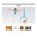
Background
Already well known in Europe and Asia, BRIC’S wanted to build a stronger brand presence in the North American market. I developed a custom CSS framework and several reusable and extensible page templates on the request of the project lead, creating a customized online presence. With the brands goals and vision in mind, the new site launched. BRIC’S more than double online sales in North America that first year.

Custom Product Layout focusing user on the high value item
This most technical challenge of the site was completely restructured Single and Variation product template. The content on the left and right is hooked in and filtered together in the core template however the design required that we split several items left, right, up, down, you name it we did it. Most of the restructuring was handled through the custom product template however a few items also had to be remove and added back with jQuery in order to match the design pixel for pixel.

Other challenges and functionality
The most tedious challenge was making all of the desktop designs mobile friendly as the site was not designed "Mobile First" There was also the issue of Flex Box not being fully supported and still vary much in it's infancy. The resulting product archives, cards, posts and other stackable content was all handled with break points, floats and plenty of transforms for vertically and horizontally centering content, text and sections.

because of the Left navigation all of the content needed margin offsets which made it difficult to reuse the same styles on smaller screen sizes. Overall this project challenged me and forced me to utilize every CSS trick in the book (at the time). The result was tedious but well executed.
Conclusion
BRIC's is still continuing to spread the brand’s online presence in the South American market.
